jstanbul · Brand identity
jstanbul identity
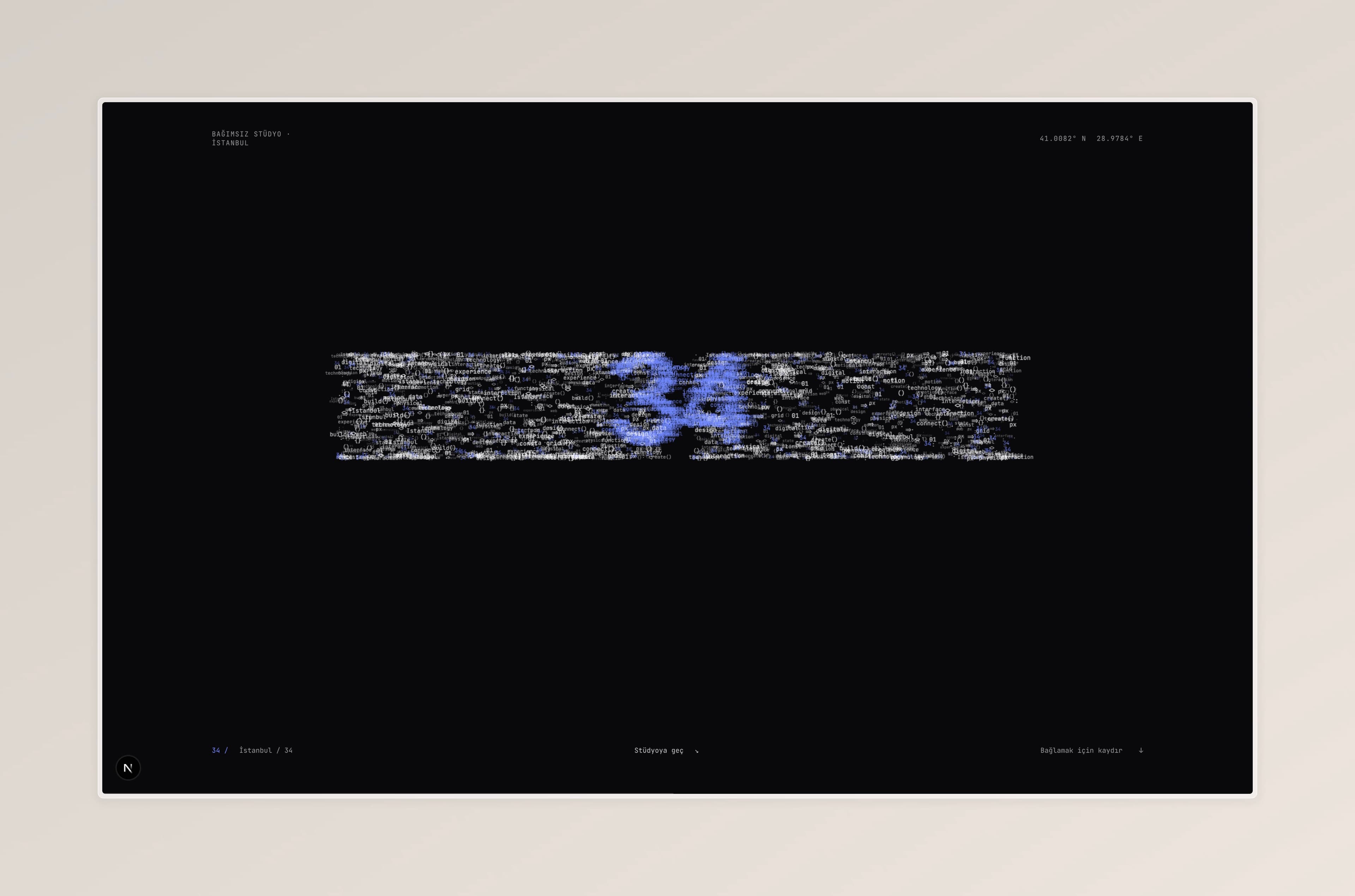
Our own identity, from the 34 mark to the details of this website.
The context
Our own studio needed an identity that could connect visual design with the way we build websites.
Our approach
A single blue, a 34 mark and a restrained typographic system tie the physical and digital applications together.
A closer look
34 carries Istanbul into the identity without turning the website into a postcard.
What we delivered
A visual identity applied across the studio website and brand materials.
- Client
- jstanbul
- Year
- 2025
- Services
- BrandingUX / UI
- Stack
- FigmaIllustrator